Wednesday, 2 May 2012

Evaluation - Audience

Evaluation - Distribution

Evaluation - Representation


In my original photographs, the model was Jessica Emmerson and she was going to be used for the contents page photo or maybe the front cover. She was wearing casual clothes; beige jeans, yellow jumper and boots. I took them against a normal wall - which turned out to be a bad idea because it was difficult to cut out - using mainly close up shots of her. Her pose was relaxed, but since they were close ups, it was mainly of her face, which I took some of her smiling or just quite serious. I didn’t think it would represent the kind of social group I am aiming for, so I had to take more photos.


However, I decided to change my model and try different poses with them; they were still against a white background but their clothing was more feminine. The model I used for my front cover was Isla Johnston and she was wearing a pink skirt – which is a typical colour for a young, pop magazine – and a black vest top with red lipstick. She was standing with her hand on her hip, smiling and since the shots were medium-long, you could see the clothes and pose clearly. This photo is more suitable for the genre of magazine I am doing and follows the typical style of others like it, for example; Top Of The Pops. The photo is aimed at young, teenage girls who may be aspiring to look like her.


It represents a very stereotypical female gender, by looking sexy, confidence and attractive, reaching at to slightly vulnerable young girls. With the colours too, it makes it even more stereotypical, with the pink skirt and red lipstick both reaching out to the bubblegum pop genre. Her pose is much like others you would see on magazines like Top Of The Pops:


Monday, 30 April 2012

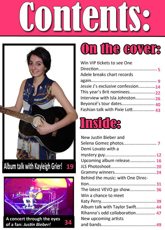
Completed contents page

Now, I have changed the photo to a one where she is smiling and looks happier, and is actually looking at the camera - which gives the impression she is drawing the audience in - it is now completed.

Friday, 13 April 2012

Second contents page attempt

With the photos added to the side and the captions underneath, my contents page is complete. However, I do not like the photo of the female used because she seems unhappy and isn't even looking at the magazine. So, I will be changing that but other than that I am happy with the way it looks.

Unfinished contents page 1

Now I have the story lines and headlines placed the way I want them on the page, I need to fill in the blank spaces at the side. So what I have chosen to do is add photos on the side. 
I have still stuck to the same house-style as what is on the front cover. Same colours and fonts being used, so it is easy to tell it belongs to the same magazine.

Finished magazine cover

Now I have added all that needed to be added, I am pleased with the outcome. It is clear to see the masthead and read the hooks and writing. There aren't too many hooks to make it looks crammed and the layout is the way I want it. There aren't too many colours which would overpower the magazine altogether.
And compared to the first attempt, I think this one is a great improvement and looks a lot better. It looks more eye-catching and with the model looking at the camera, it's like she is looking at the readers, drawing them in.

Unfinished magazine cover

This is my unfinished magazine cover. All that needs to be added is the small details like price, date, barcode etc... along with a box along the bottom with an advertisement or competition.
I chose to go with this photo because it's a typical pose what you would see on a pop magazine cover.

Tuesday, 27 March 2012

First attempt of the Article.

This is another plan of my article, however I changed the fact of having two small photos, and decided to have 1 photo taking up a full page and a small photo on the 3rd page. Also, the colour scheme changed to match the front cover and contents page. And i kept the idea of having a quote, but I had it on the 3rd page, again in the same style as the magazine title. I changed the same intro at the top to make it more bold, so it stands out.

First attempt of the front cover.

This was the previous cover I was going to use, but I decided the photo wasn't right and neither was the layout. So, I took more photos and completely changed the layout and colour scheme of it all. However, the title and fonts are the same as I did like those. The pose on this photo didn't look right and I didn't like how the main hook and small intro was centred.
I ended up with the front cover below.